


Next plc Annual Report
Design
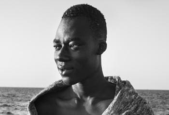
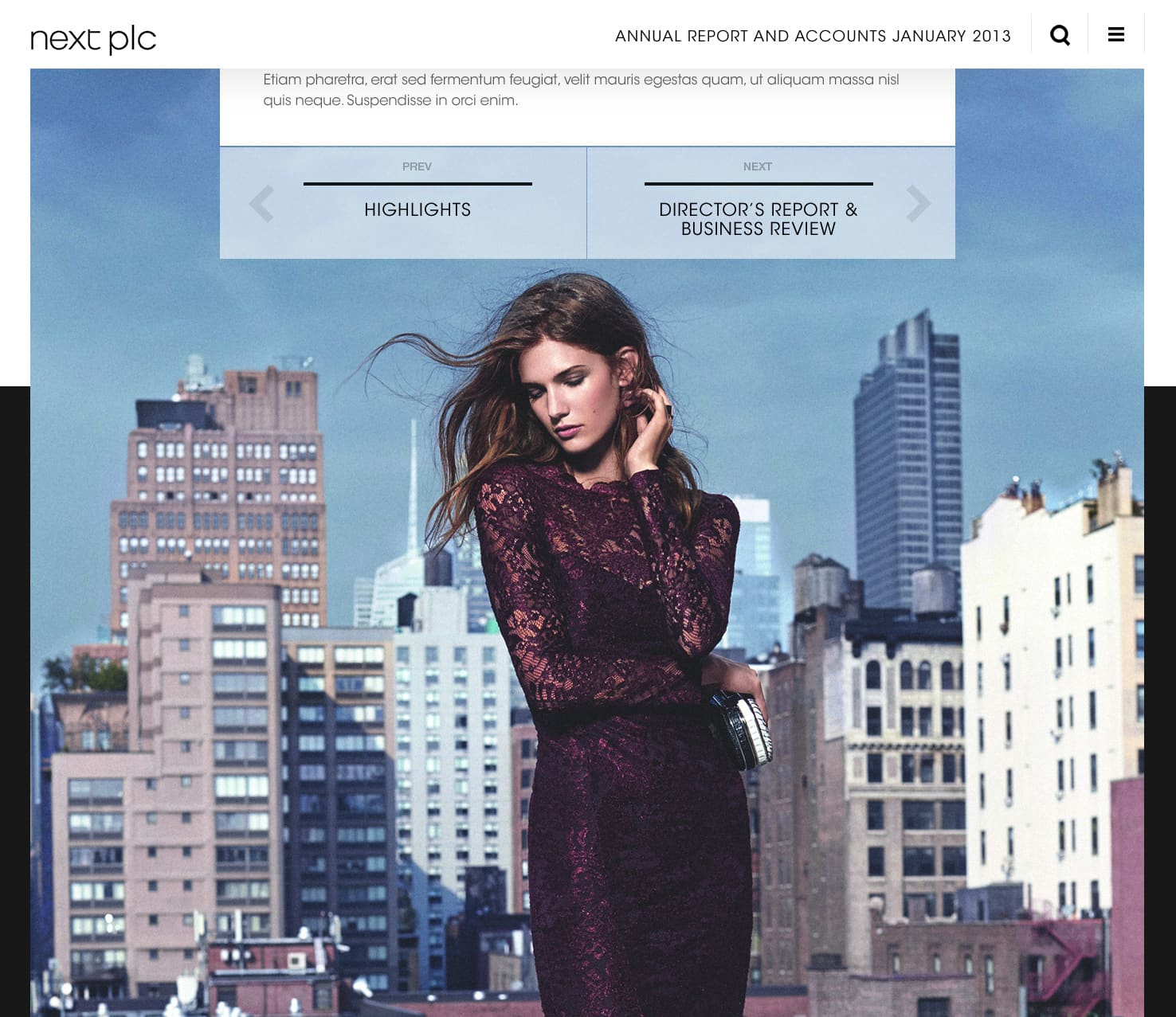
Getting the most value from the photography was key to the Next brief. As a simple and clean approach, the pure B&W interface provides a neat contrast for users and heightens the impact of the photography.
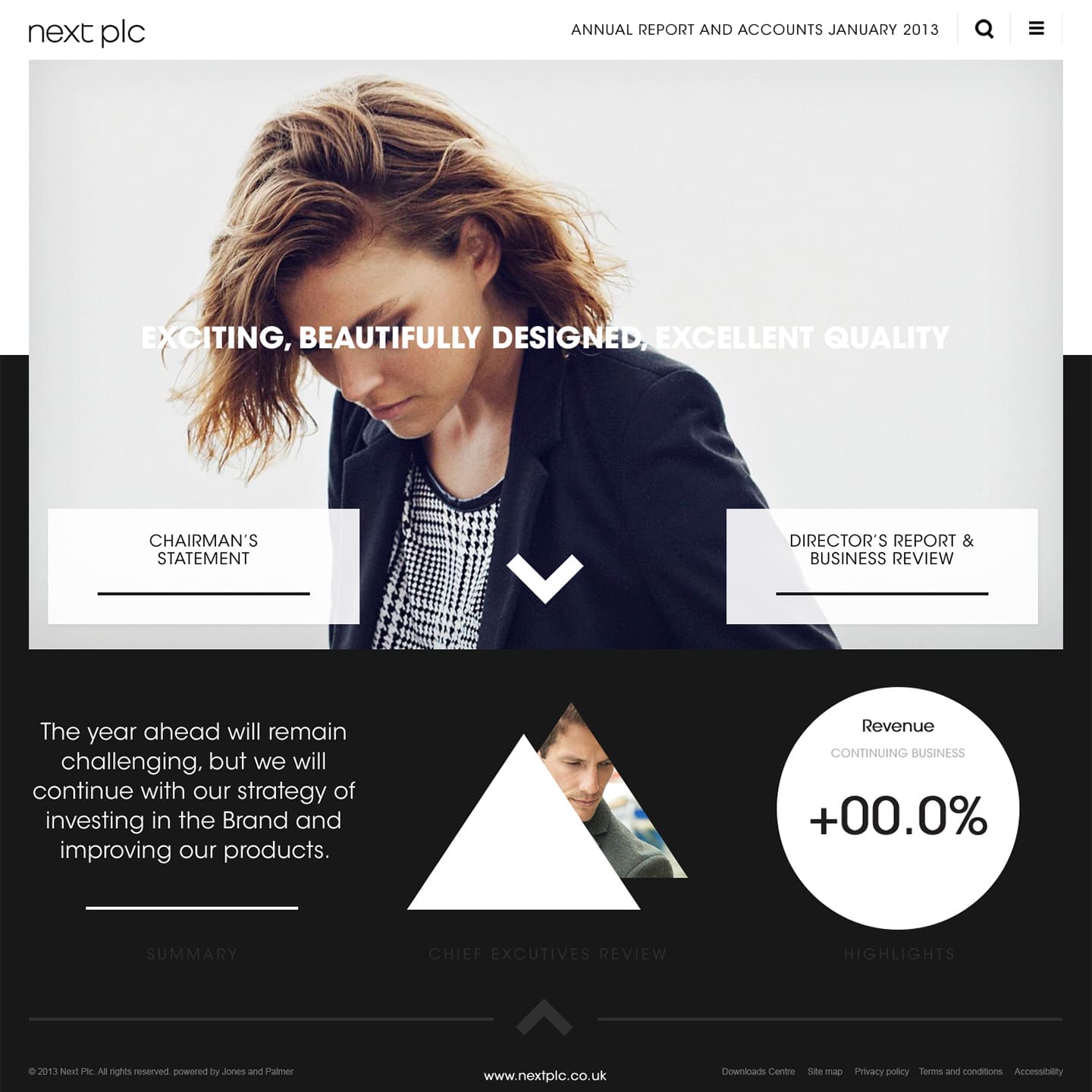
Initially inspired by medium.com. My approach to the Next Annual Report was to lead with the content which meant stripping back superfluous feeds and panels in favour of a large, simplistic area to house the copy. Photography, a key component to the Next brand, is fully revealed once the user has scrolled to the end of the page.
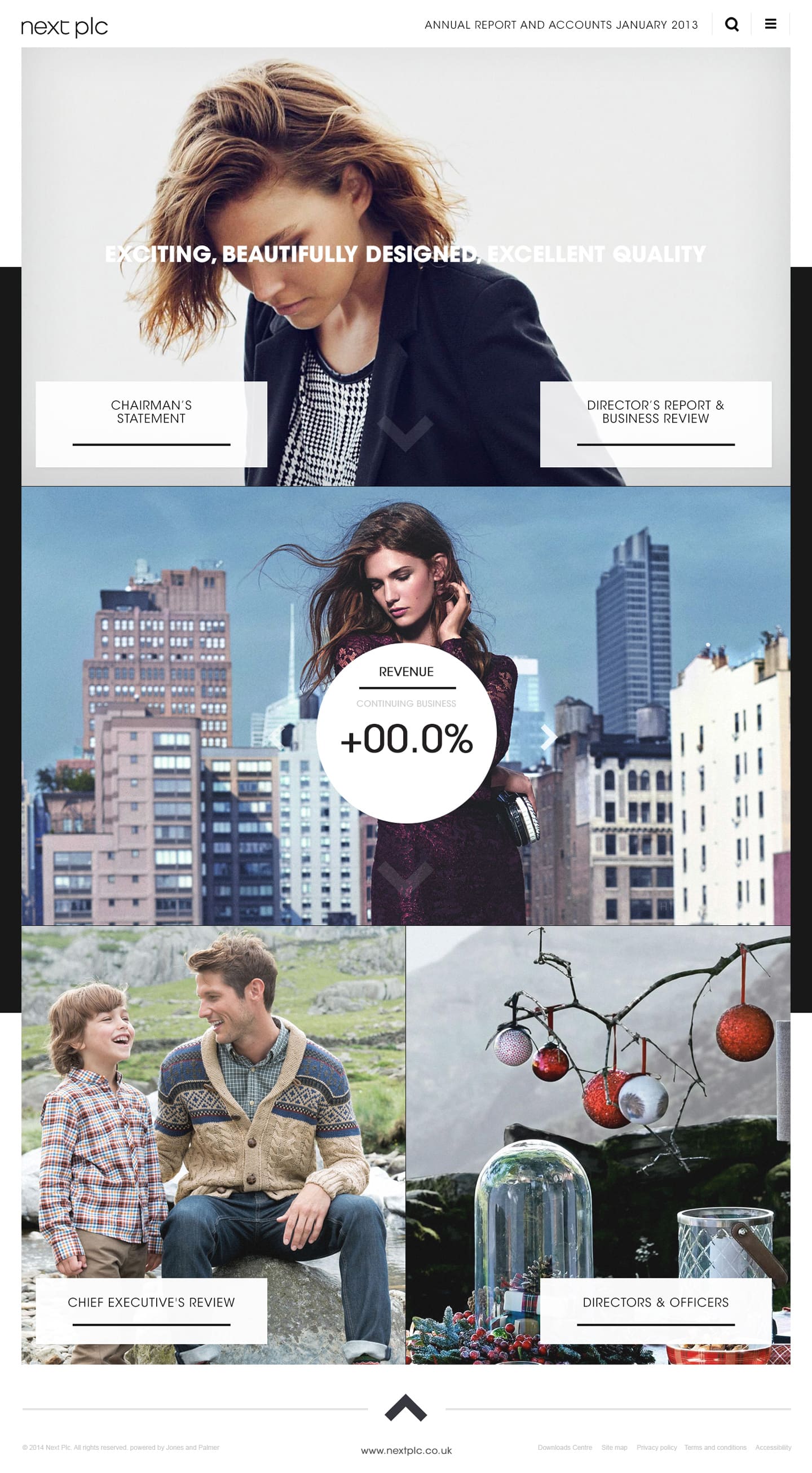
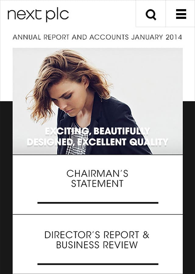
Mobile

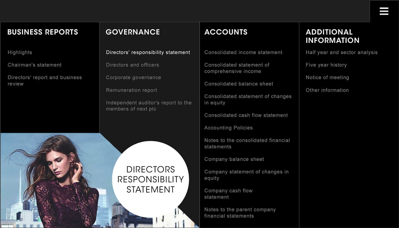
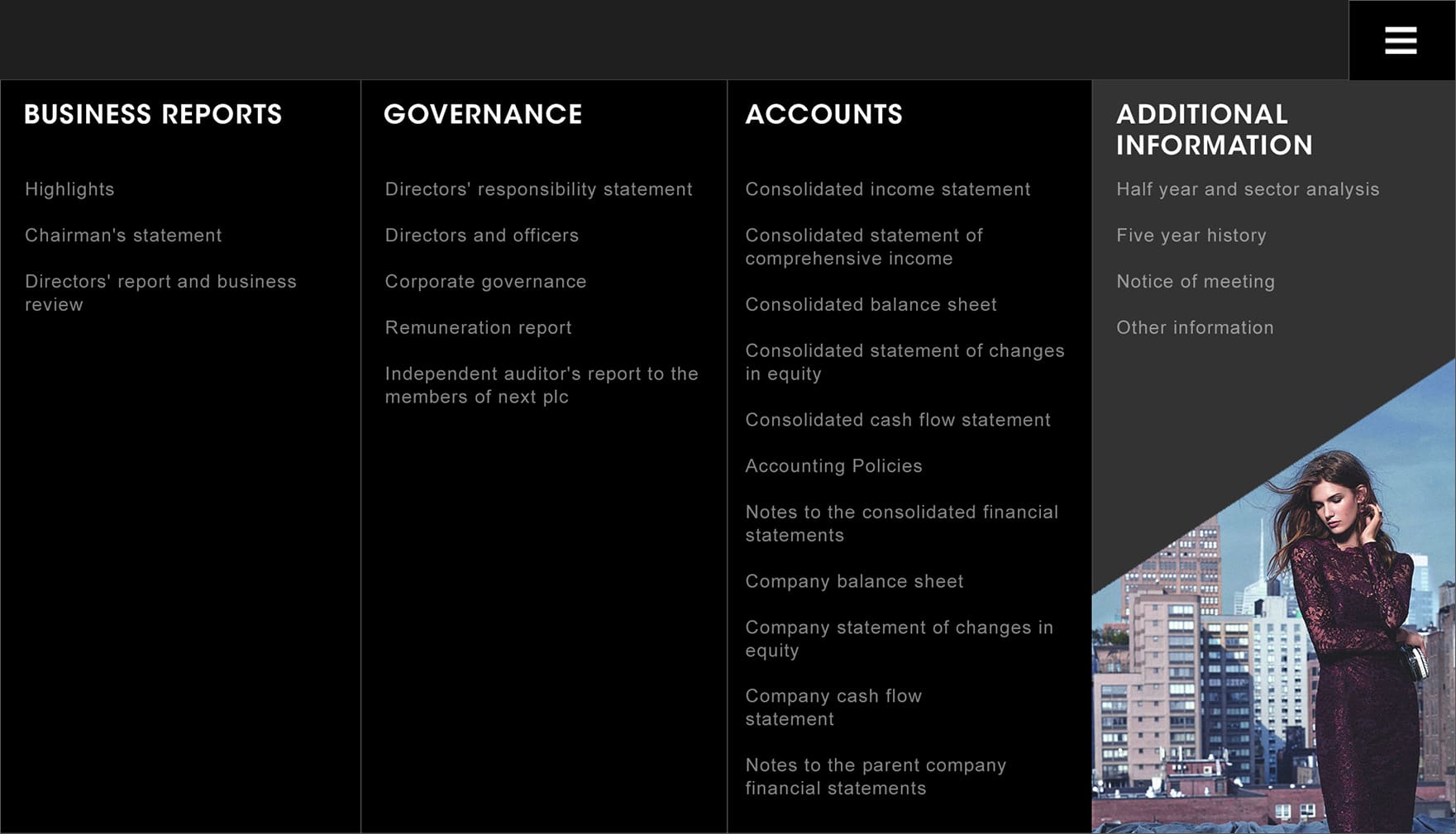
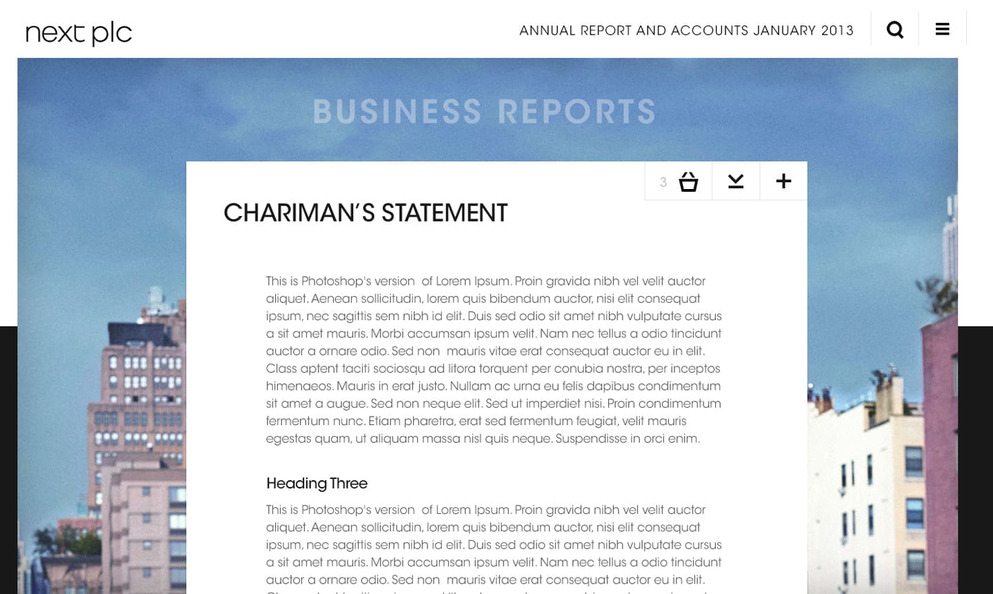
Navigation
Tiered drop down navigation makes the site structure visible to the user. Location awareness improved with empahesis on current section